

Last Tuesday 10th March news reached us that music manager Tom Watkins had passed away (on the 24th February 2020). Having worked extensively with Tom and the bands he managed during the 90s, and in later years visiting him in his famous White House, we turned to Twitter that night to catch up on the many obituaries and colourful comments from people who knew him personally or had heard about this larger than life character.
We will always have a huge amount of respect for Tom. He profoundly influenced us at Form®, helping us develop and grow and he certainly affected the way we worked. We want to share some memories of a spectacular time in culture thanks to a leading light in the industry.
It’s fair to say that he had a polarising effect on people but the one thing few could deny was the sheer life force of the self-styled “Rich, Fat, Gay, Lucky, Bastard”. Whoever he met, and whatever he did, you never forgot Tom Watkins. One of the last bona fide “svengali” music managers, he managed bands with a legendary autocratic style at a time when the music industry was a wonderful place of mavericks (before the accountants moved in to rule the roost).
Tom demanded allegiance from everyone he worked with. At best it was a roller-coaster of adrenaline: Riding on his compliments and gifts when he was happy or the flip side, when he felt betrayed, he could also be ruthless. When we announced after many years of collaboration that we needed some ‘space’ in the working relationship, we’ll never forget coming into work one day and seeing miles of fax paper on the floor as Tom had sellotaped an A4 sheet of paper his end into a looping stream of faxed anger on repeat.
Paul West had previously worked for designer Mark Farrow at Three Associates/3a in Neal Street from ’89-90 when Tom and Mick Newton managed bands including Bros, Pet Shop Boys and Electribe 101 a floor below. Paul left 3a and set up Form® in 1991 with Paula Benson. Driven by the energy and inspiration from post-rave minimalism, early clients included London College of Fashion, The ICA (working closely with Damien Hirst on his first solo exhibition catalogue) and bands on varying record labels from indies to majors: Slow Bongo Floyd (Epic), Doug Lazy (Atlantic), Skin Up (on Dave Dorrell’s Love Records) and the influential ‘Independent 20’ compilation series (Beechwood Music). Collaborations also continued at the time with Vaughan Oliver on 4AD projects including Cocteau Twins box set and Ephraim Lewis (Elektra).
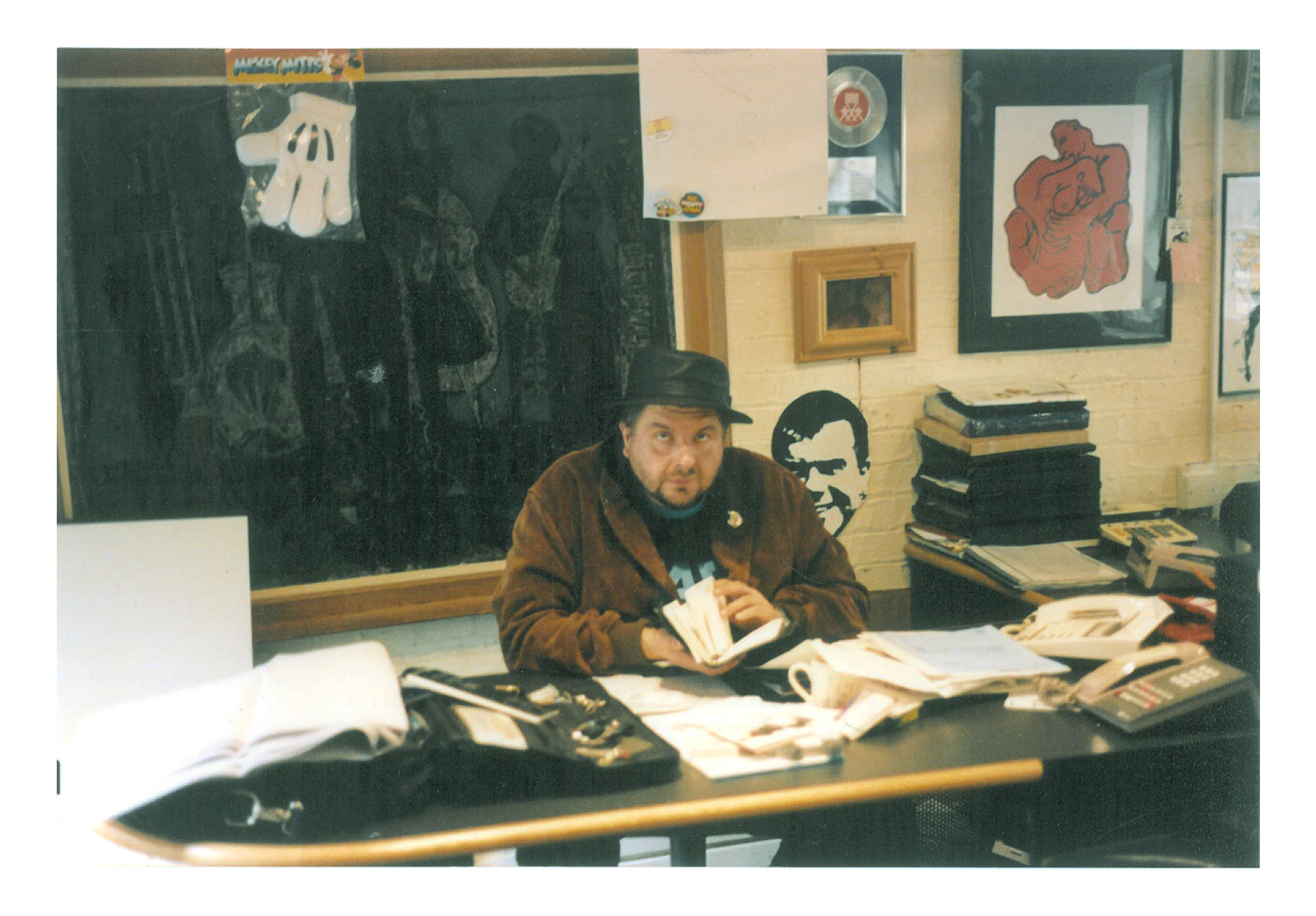
This varied client base kept us working weekdays, weeknights and weekends. And then a phone call came out of the blue from Tom. He had left Neal Street, set up Massive Management and wanted to meet us to talk. We went to his legendary Maida Vale house (which doubled up as the office) and we sat listening as he talked passionately about his vision, and how he wanted us to be the design agency responsible for the total look and feel of all his new ventures, from bands to various businesses.
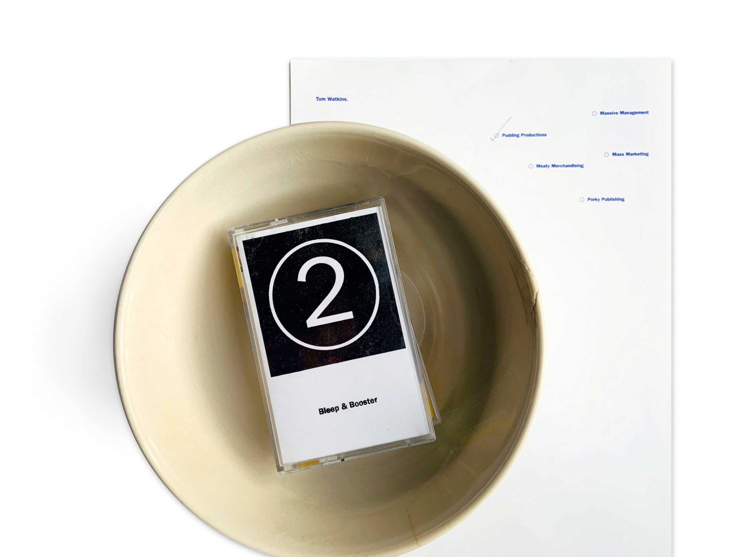
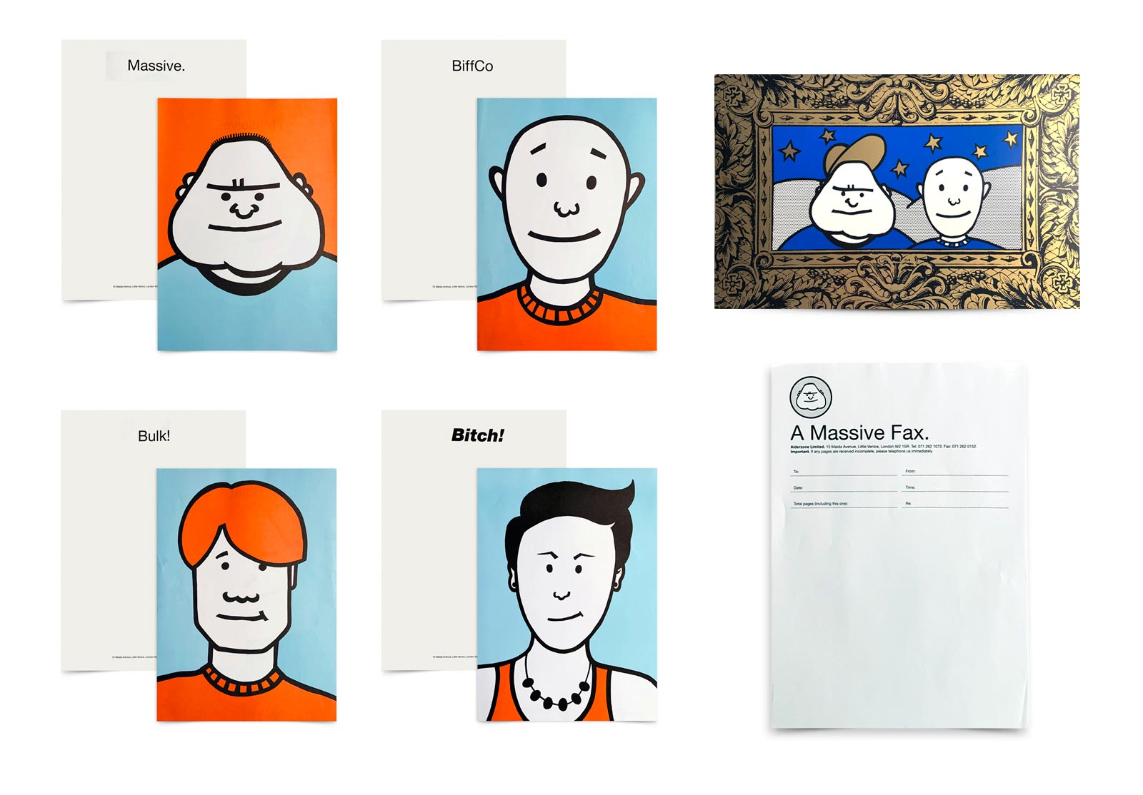
We were to start work IMMEDIATELY (naturally Tom!) on creating identities for the five in-production bands he was managing (we call it branding now but this word was never used in the music industry at the time), whilst also designing and putting together a mailer for Pudding Productions (a pudding bowl with a gingham cloth cover, to house five demo tapes) in addition to a stationery range for his five companies which encompassed merchandise, publishing, marketing and management.
An empire builder from the get go, Tom was always specific about what he wanted and this was one of the joys for us because he was a sharp, uber-talented creative who saw entire campaigns in his head and he influenced the ‘360 degree thinking’ that we’re known for at Form® to this day. The creative meetings we’d have were explosive with Tom stamping up and down yelling “Faaack me I LOVE it!” as he’d suddenly focus on a scribble we had done. In that scribble he had seen a merchandising gold mine.
We would often leave meetings at Massive elated at the thought that this was a person who would get behind our ideas and make sure they happened. To this day there is no one else who has made us feel quite like that. Tom worked from instinct and his instinct was always refreshingly simple, that in life it is so easy to do something RIGHT if you have the energy and will to make it happen. Of course when he didn’t like something, you could be certain of the polar opposite reaction and he had absolutely no time for people who questioned his vision past a certain point.
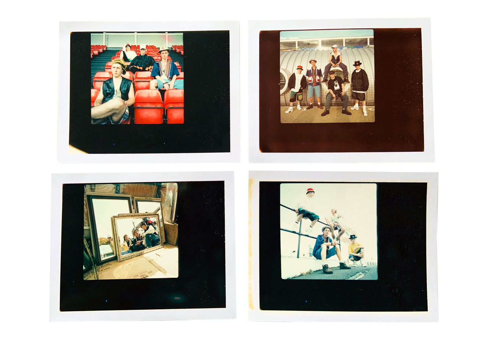
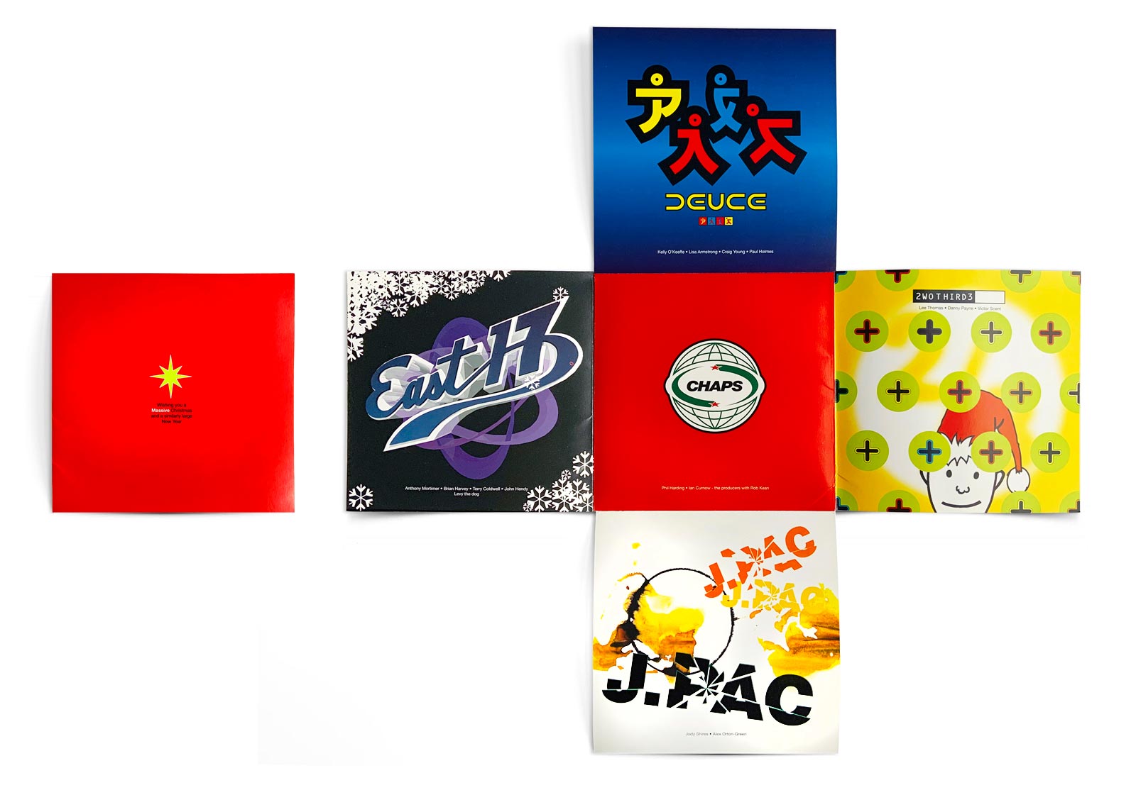
East 17 clearly captured Tom’s imagination from the start. Four lads from Walthamstow headed up by song writer Tony Mortimer. Tom loved the idea of an antidote to Take That, and this was very much his stance – to offer the knee jerk reaction to an established order of things.
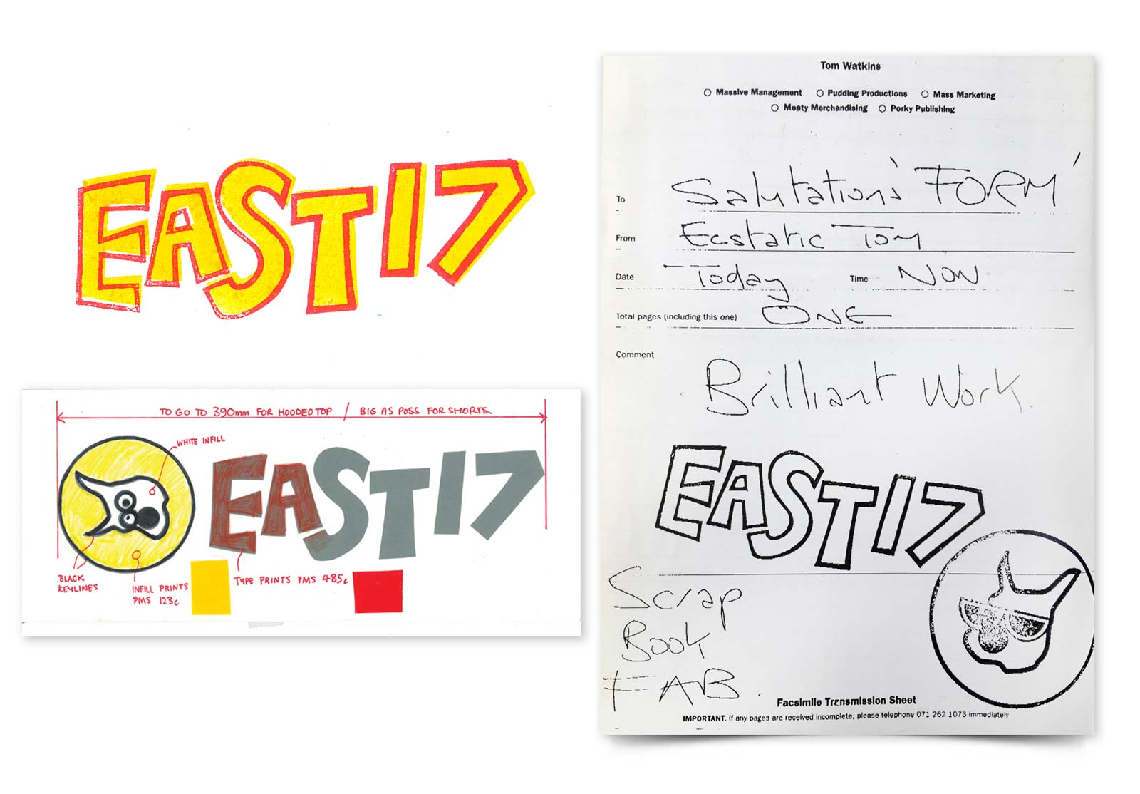
For East 17’s creative direction, Tom was enthusing about the logo from the film ‘Johnny Suede’ – a typeface with a crude hand drawn outline in contrasting colours. This, combined with our love of Max Kisman’s ‘TYP’ DIY typography, influenced the East 17 typographic logo.
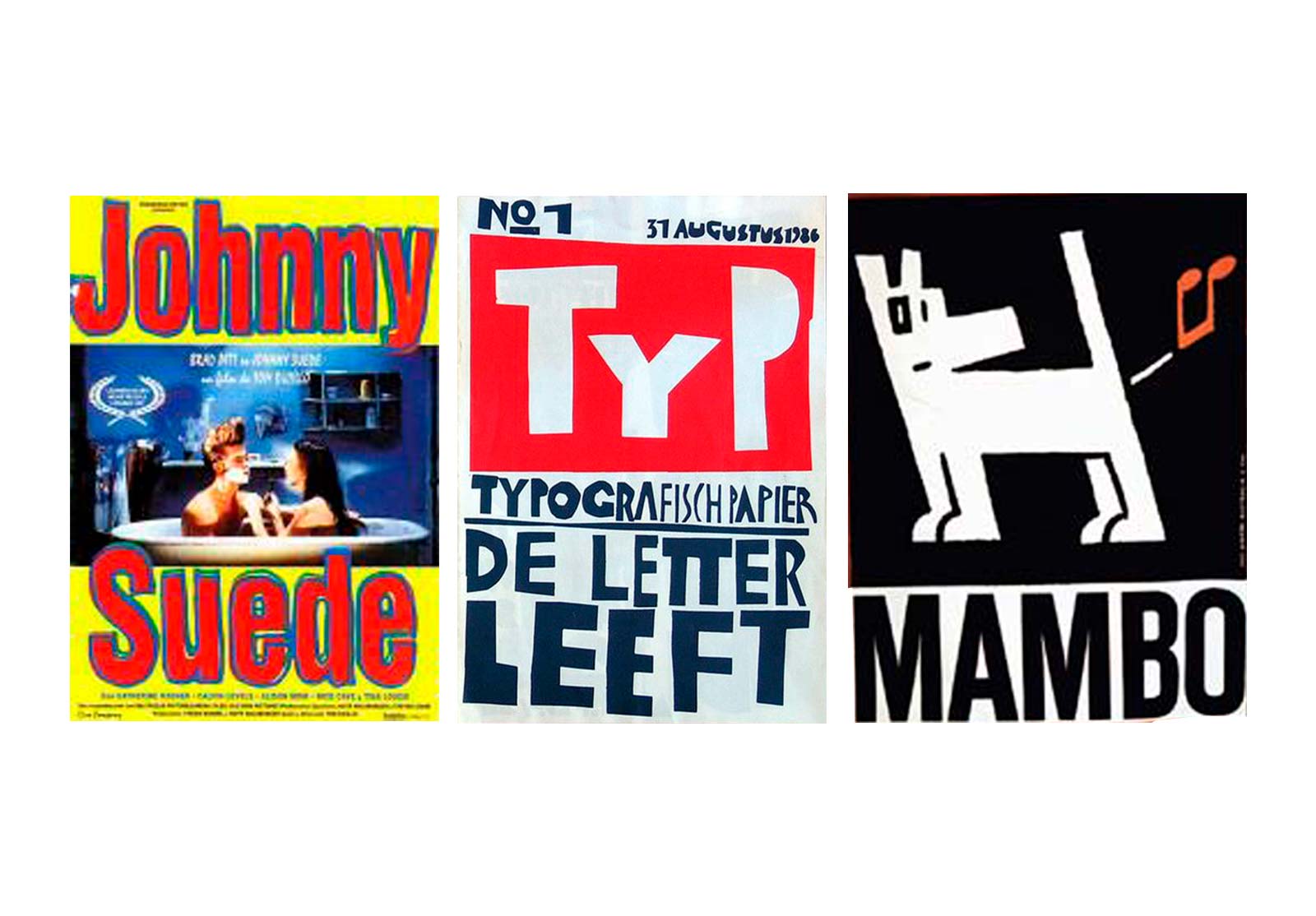
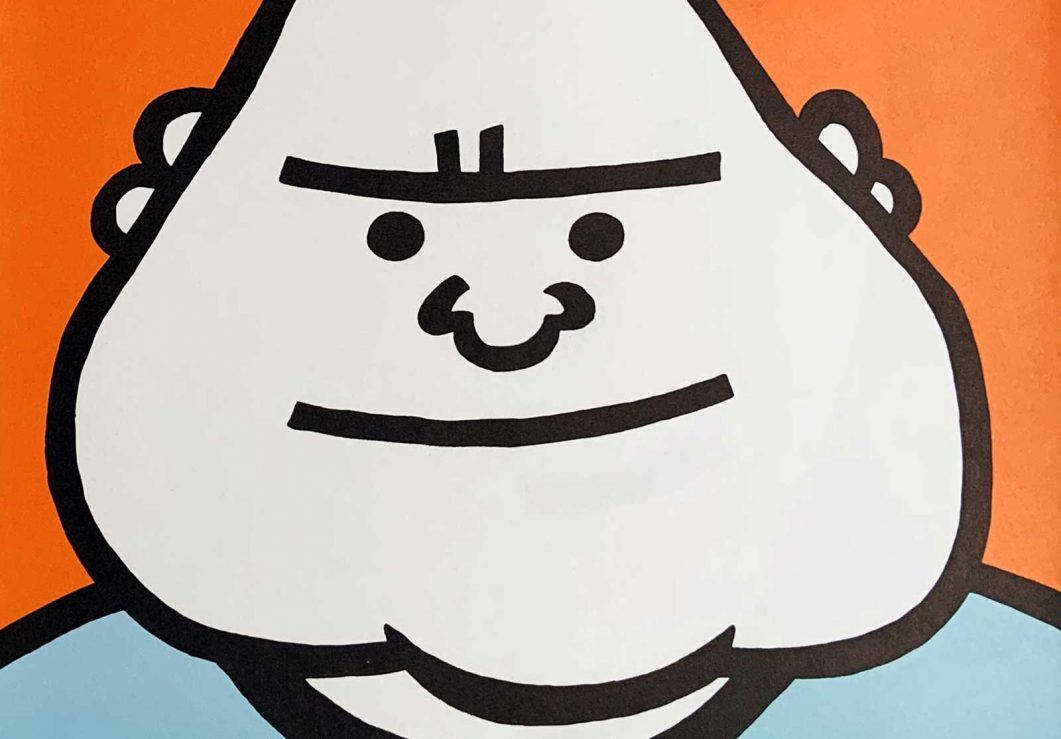
Alongside the logotype we created Bob Dog, a hand-drawn, slightly stoned canine. In the Acid-Rave transition of the early 90’s, fashion brands including Stüssy, Michiko Koshino, Mambo, Joe Bloggs, World Service, Travel Fox, Kickers, Timberland and Levis (white) were very much in vogue, often represented by large bold typefaces and bright colours, especially with Mambo’s gonzo ‘surf’ graphics.
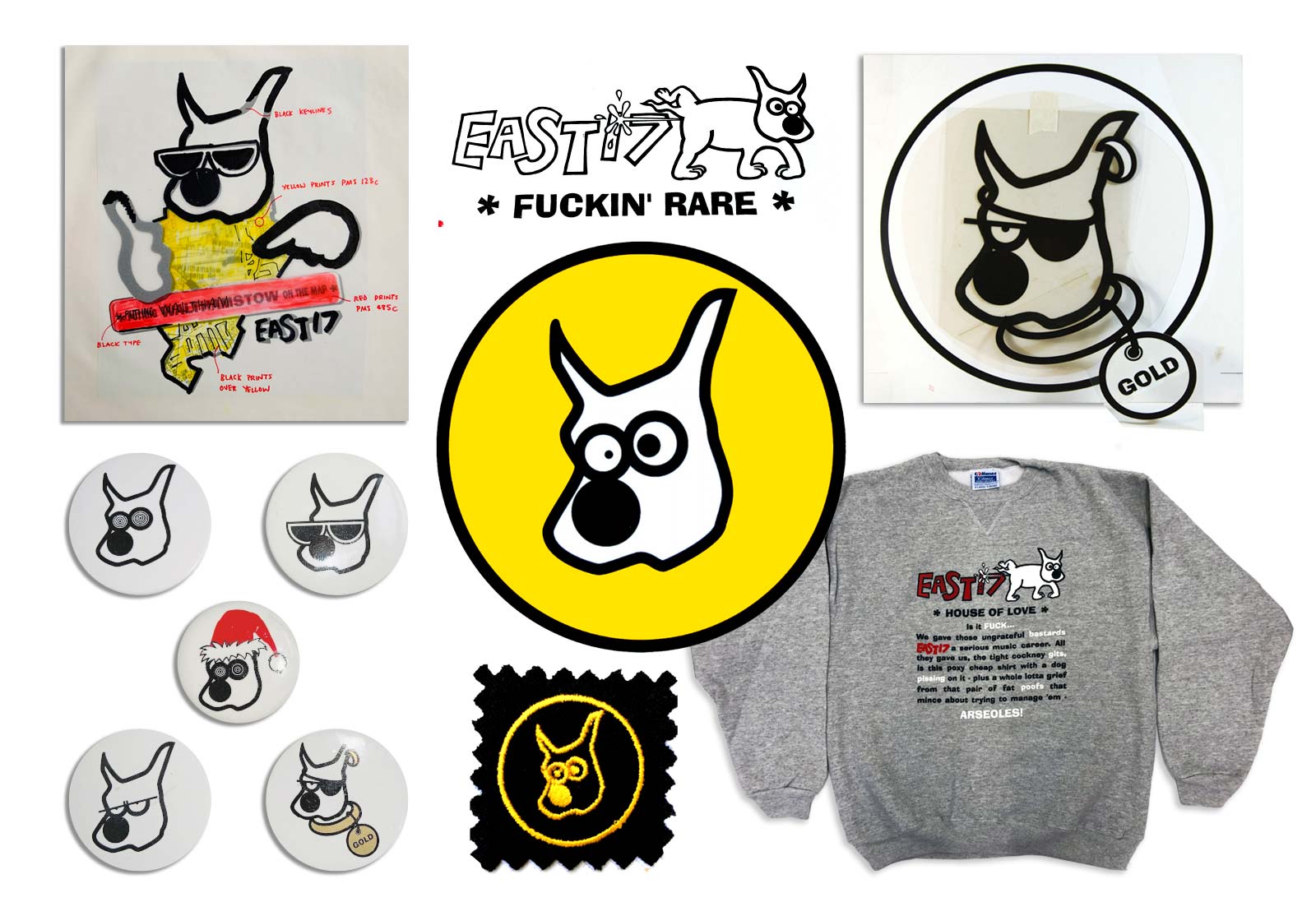
The Mambo style was influential to Bob Dog. We drew a few different Bob’s and faxed them to Tom. In nano seconds he was on the phone: “I LOVE IT!” he was yelling with excitement. Suddenly the band had a mascot and a pet dog (called Levy – not Bob!) appeared in all the photoshoots, and everything became about dogs. We created multiple Bob’s with different eyes that represented Tony, Brian, John and Terry. ‘House Of Love’ (the band’s first single released in 1992) featured Bob Dog as the cover illustration – a brave move for London Records as the De rigueur boyband chocolate box record cover was ‘as dull as dishwater’ (a Tom-ism). ‘Gold’ (featuring Bob with a special Pantone Gold – anarchy!) was the second single and we were off on a full throttle journey as East 17 became an enormous band, selling 18 million albums worldwide.
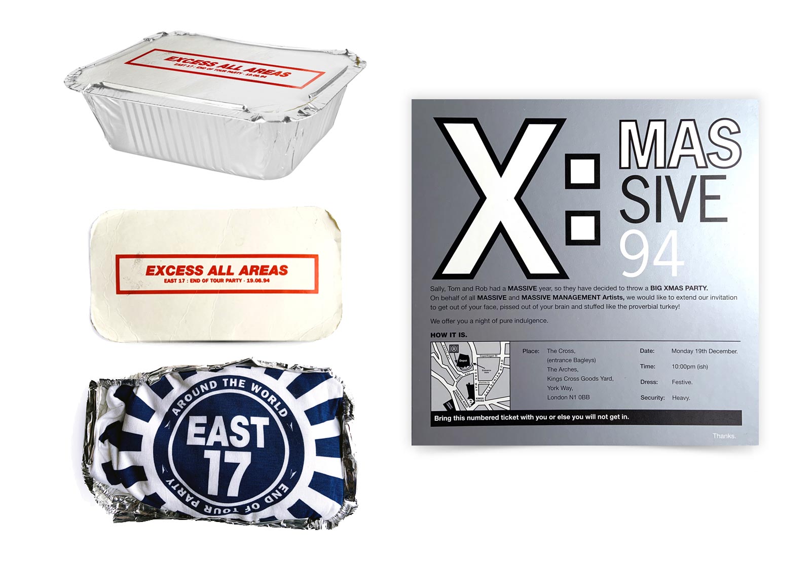
True to his word Tom made sure we designed everything for the band (until our parting of ways after their third album ‘Up All Night’ in 96). In four years we designed all the Vinyl, CD’s, MC’s, Mini Discs, Fan Club literature, tour and retail merchandise – from sticker sets, duvet covers to crisp packets, because Tom understood the power of branding and design continuity. Something we’ve not really experienced since. He fought incredible battles for us if artwork was adapted without our agreement and this was probably the Tom we loved most of all. Extraordinary generosity and the highest regard for team playing.
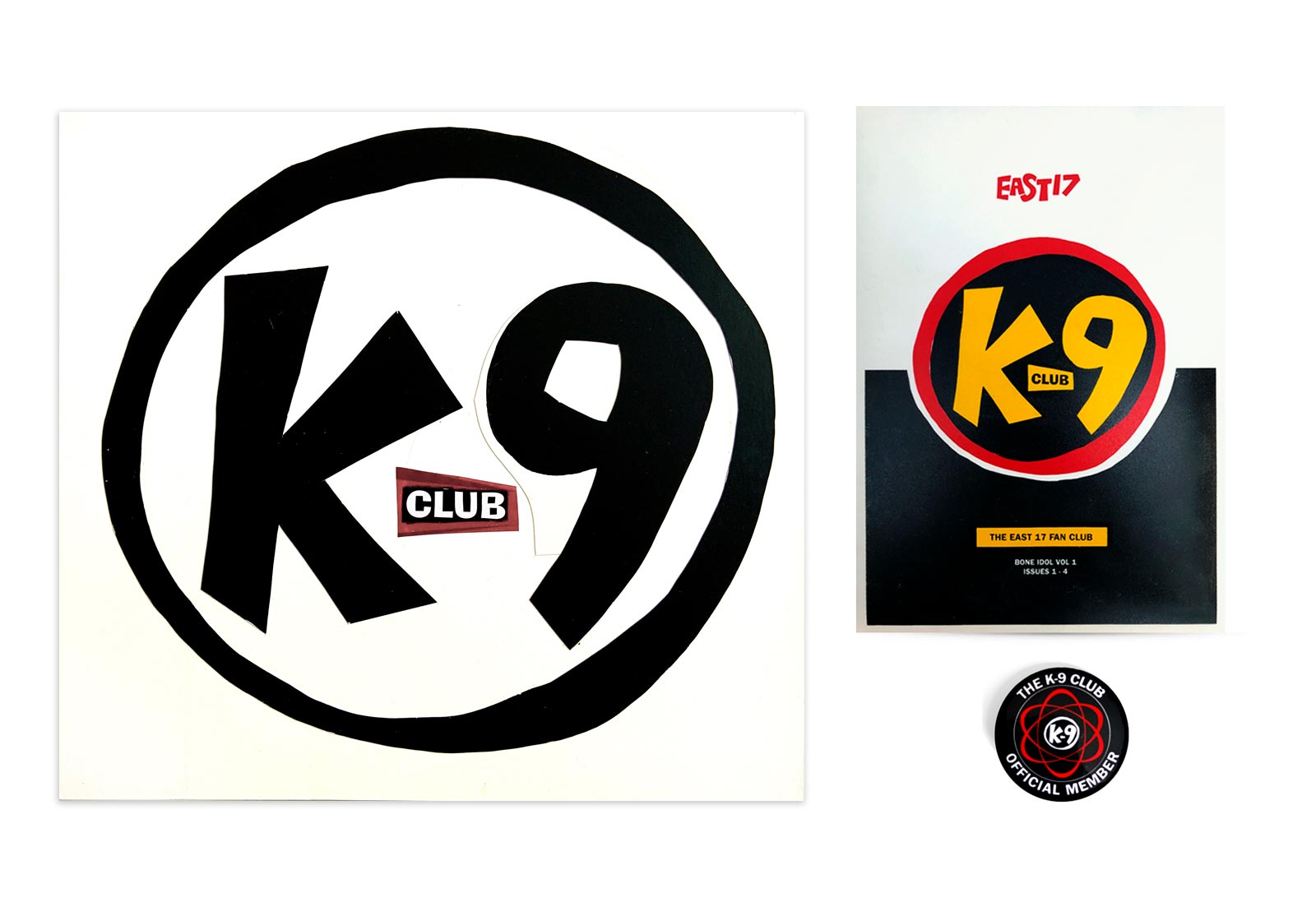
Lawrence Watson and Chris Clunn were the photographers, Mike Hrano ran the K-9 Fanclub and London Records were the record label with Keith Bennett in marketing and Juliet Sensicle who gave an indie edge to a Pop band’s press communications.
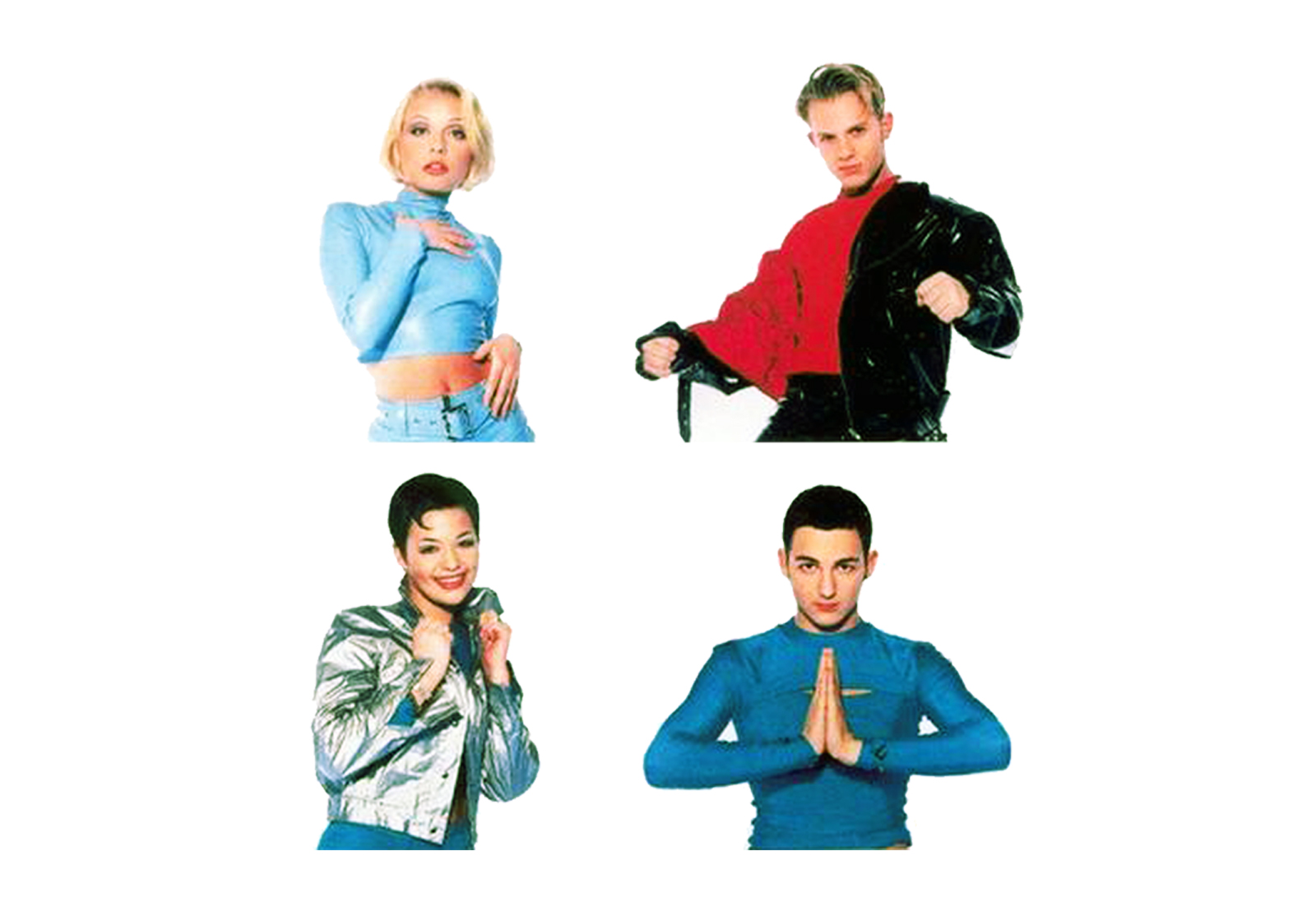
After the first wave of East 17 came Deuce (also signed to London Records): Two girls and two boys who we dressed up in leather and latex gear by Murray and Vern, and with Peter Ashworth as photographer (after we’d seen a Skin Two fetish brochure he had shot). Tom REALLY loved the subtle subversion of a ‘teenie pop’ band. We came up with the phrase “Power Pop” which stuck. Everyone was aligned in pushing what was possible in the Pop music genre and Tom moved mountains to make these things happen.
Another one of Tom’s genius moves was to absorb as many areas of the industry as he could into his control. He managed the producers (more points on the song royalties), he brought in songwriters and cutting-edge re-mixers for the Club 12”s that would go straight to the clubs (Tom realising many years earlier that reaching the Teen and Gay market were integral to his all of his band’s success). When East 17 went on their headline tour, he’d ensure his other fledgling bands would be the support acts – not only for their exposure but because their record label would also pay for the opportunity.
Not forgetting the parties… Tom would hold THE most lavish all night parties for new band showcases, end-of-tours and birthdays. No expense was spared and they are much remembered and talked about. This was a side of his generosity which reflected the old school music industry – an opulent decadence designed to create a ‘wow’ – no one could do it like Tom Watkins.
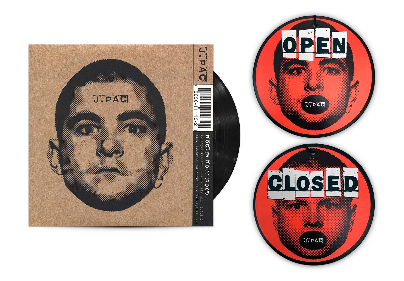
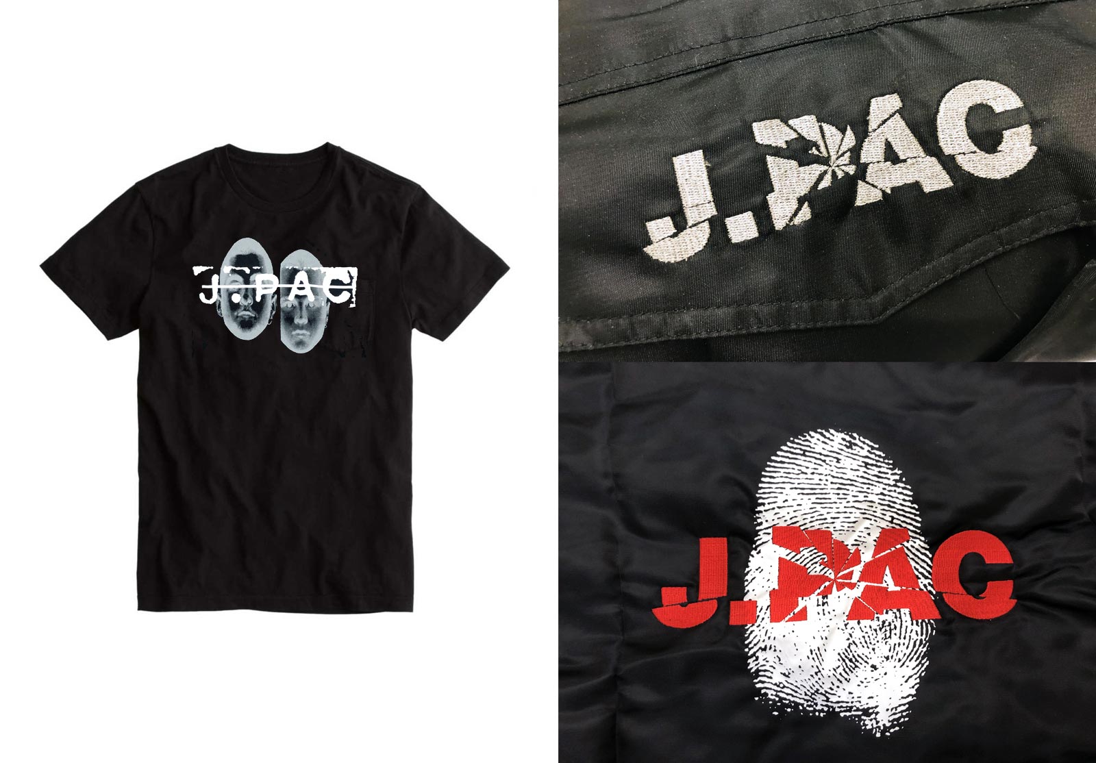
Apart from Massive’s well-documented success stories, there were the bands that never quite made it. J.PAC, a proto The Streets-meets-The Prodigy combo had the potential to be huge. They were as comfortably dangerous as you could get in the Pop world and were daunting live. For their first single ‘Rock n Roll (Dole)’ released in 1995, Lawrence Watson photographed Jodie and Alex and we scanned their portraits, bitmapping them into a crude halftone dot, influenced by Warhol’s ‘Most Wanted Men’ series. This won the Music Week Awards ‘Best Single Design’ that year. For the J.PAC campaign we designed and digitised fonts made from stencils, cut out letters and handwritten scrawl because Tom had the ability to inspire this creative energy.
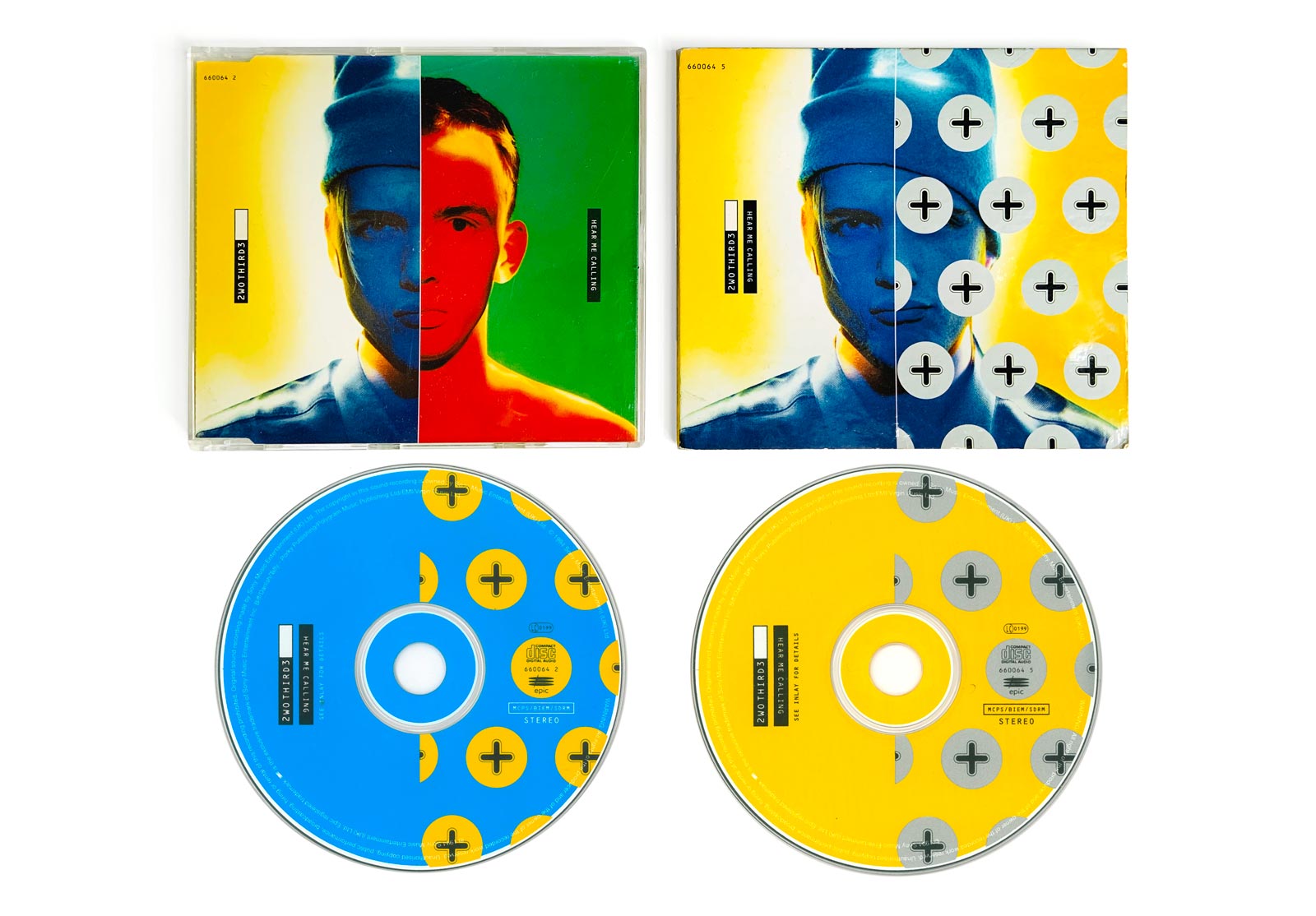
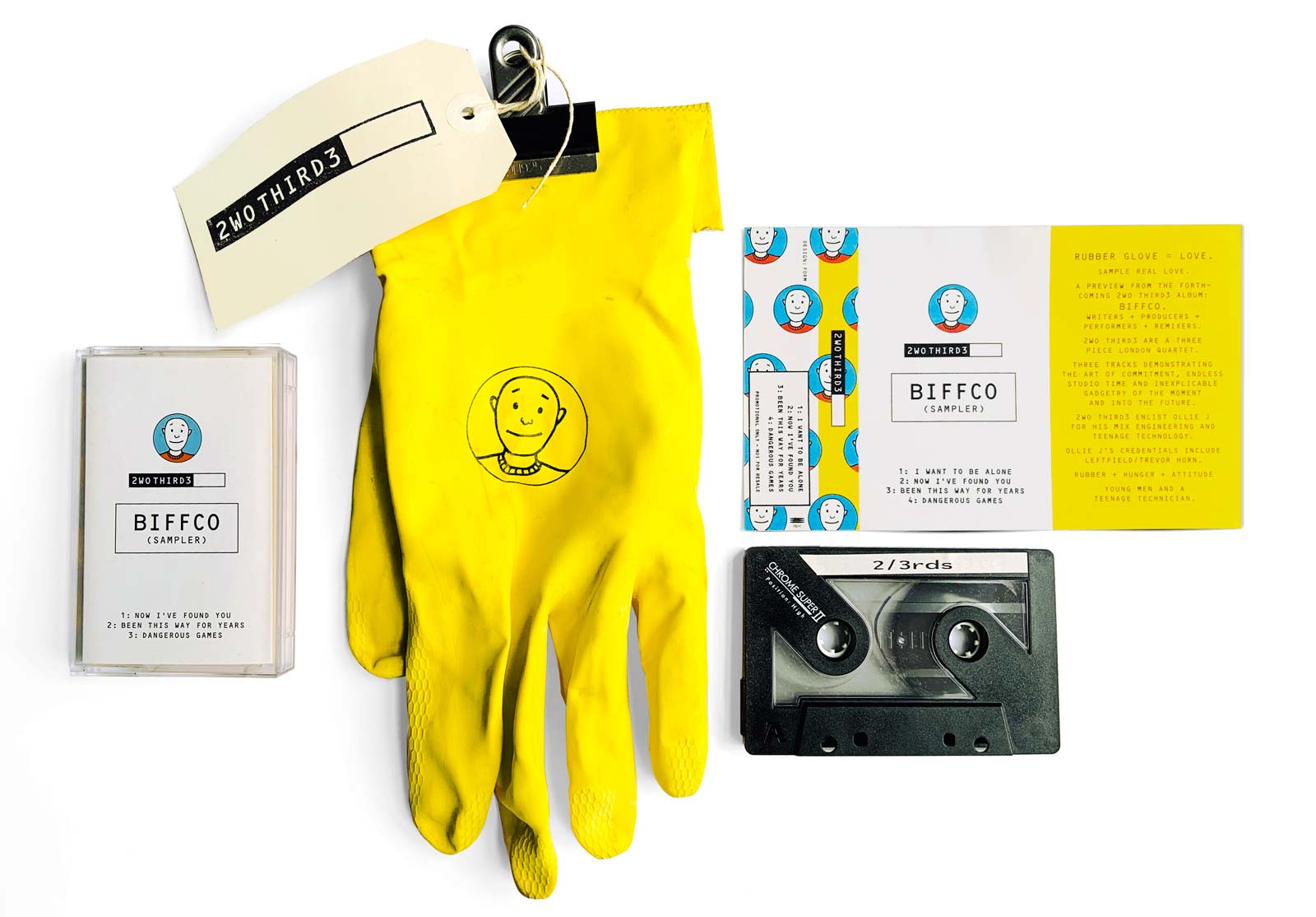
One of the more infamous projects we still get asked about is Two Thirds, or ‘2/3rds’, or ‘2WO THIRD3’ as we named them typographically. The incredibly talented Richard Stannard (aka ‘Biff’) took the helm as songwriter and producer, and we enjoyed working closely with marketing manager Catherine Davies at Epic who allowed us a huge amount of creative freedom. By now, Tom completely trusted us to come up with the creative goods while he was focussing on his Massive expansion.
A recently graduated photography student came to see us with his portfolio in ’94. Spiros Politis had been experimenting with vibrant colour backgrounds while shooting portraits on long exposure and bathing their features with light (pocket torches were a speciality). The results were incredible, we met him at just the right time for our work on 2WO THIRD3. Epic allowed us the relative luxury for Spiros and us to have two whole days in a studio to shoot band members Lee, Danny and Victor for the first single ‘Hear Me Calling’ and all press-related photos. It was to be a huge press campaign and Epic required a lot of images. We threw so many shoot concepts at Spiros, it’s hard to believe how much he took on for his first major shoot!
The 2WO THIRD3 shoot was a huge success and forged a life-time collaborative friendship between us and Spiros. The band released three further singles before their all too early demise, halting what could have been an edgy, joyously dark, openly gay (well before its time in mainstream P-O-P) assault on the charts in true Tom style.
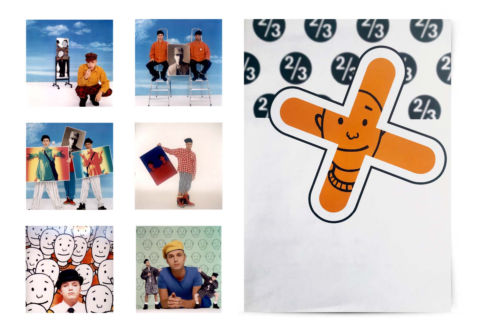
Alongside the logotype we created a ‘Biff’ linear portrait to always appear on the covers and promo club mixes. It always slightly irritated us when the Best of Blur was released in 2000 with Julian Opie portraits because some people thought we had been influenced by this style, despite Biff being drawn 6 years earlier.
We’ve spent a few days going through the Massive Management section of the archive and we’ve realised this is the tip of a HUGE iceberg with many bands we haven’t mentioned, and the bands we HAVE mentioned we haven’t shown enough of! To be continued in future posts no doubt.
Working with Toms bands – from the rave era, to the burgeoning drum’n’bass period, with BritPop sandwiched nicely in-between – was a magical moment in time when music genres were exploding with energy and everything was still possible with Tom commanding the field. Many people in the industry were too excited to see what he could create next to put up too much resistance and he wouldn’t have paid a blind bit of notice if they had anyway. Of course it couldn’t last, but it was a ride and a half while it lasted. Thanks for the journey Tom.