

Over two decades of Form’s music design has been dissected by Classic Pop Magazine.
Having designed hundreds of chart topping record sleeves over the years, Classic Pop Magazine interviewed Form Partner Paul West about Form’s contribution to the world of pop and music design.
It was fun revisiting some of the earlier work and it turns out that journalist Andrew Dineley has an encyclopaedic knowledge of our work which he explored over five pages of the magazine. He was even familiar with the very first record sleeve we ever designed which was for Doug Lazy back in 1991.
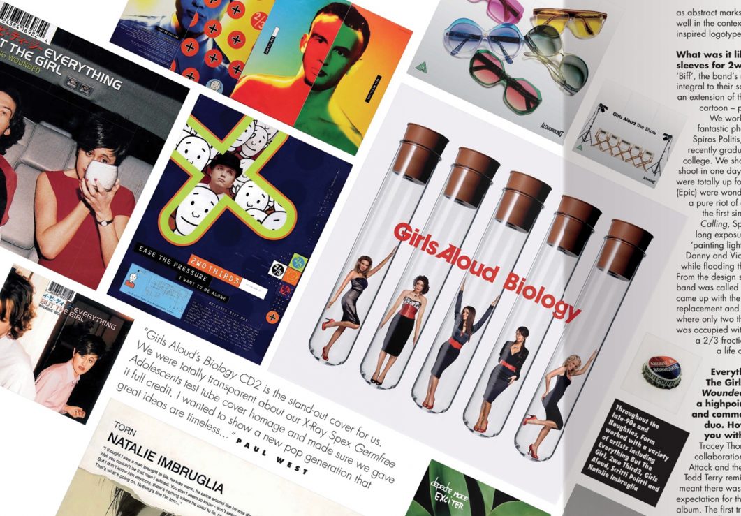
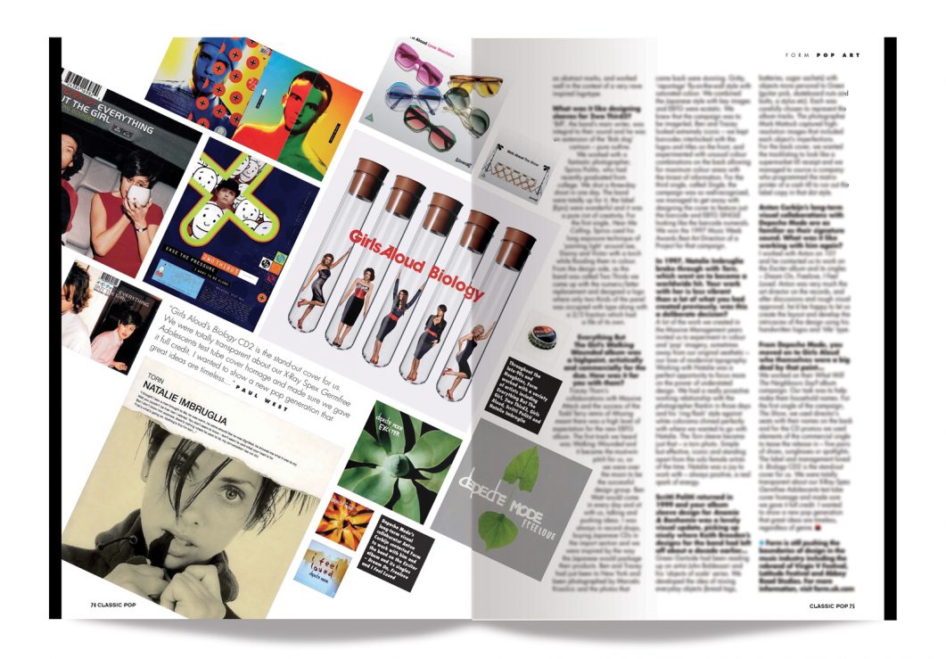 Paul gave him a tour of the behind-the-scenes process of record sleeve design – from Depeche Mode to Natalie Imbruglia and from Girls Aloud to Everything But The Girl, and discusses how he got into designing record sleeves in the first place.
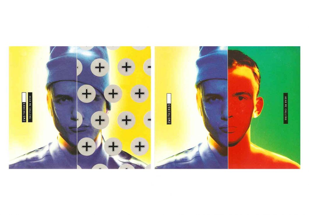
Some of the less well known pop bands we worked with such as Deuce and Two Thirds (photographed by Spiros Politis) in the ’90s have really developed a cult following, so Andrew dug deep into our approach to art direction, photoshoots, logo and record sleeve design for these artists too.
It was a treat to see the first record sleeve we designed, published in a magazine – “H.O.U.S.E” by Doug Lazy in 1991.
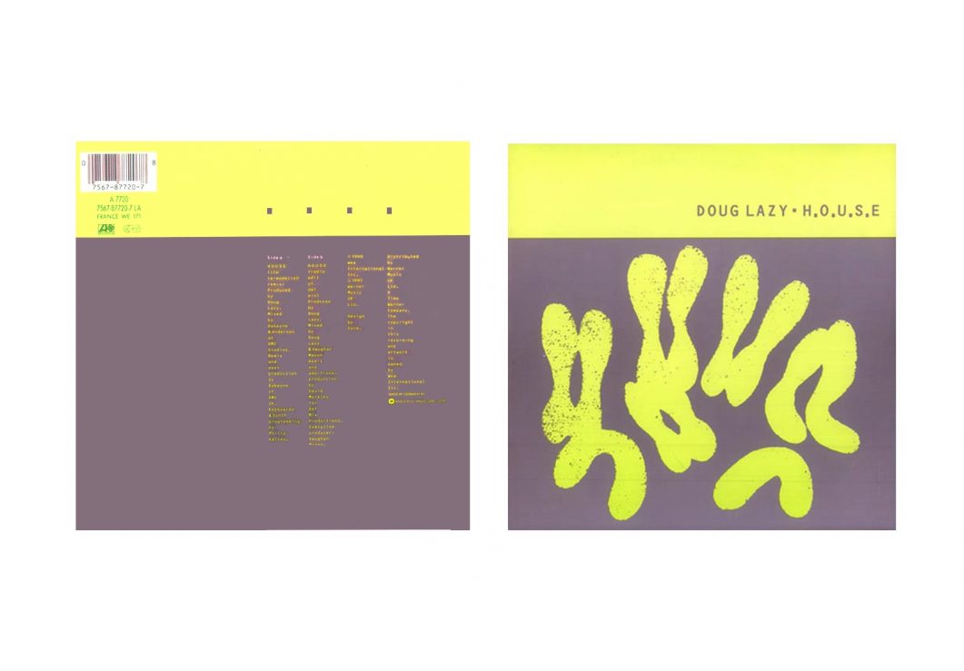
For “H.O.U.S.E” the illustration is an image of the chromosomes of a housefly. We liked the goofiness of it in that kind of ‘rave era’ sensibility – it was organic, and felt slightly like a club-style projection. We combined this with the ultra-digital typeface OCR-B. We were very much inspired by contrasting colour unions: acid yellows/flourescents and graphite / gun metals was (and remains!) a favourite. We were limited to a two colour print run on this release, which we played to our advantage opting for the ‘Form favourite’ Pantone combo.
“H.O.U.S.E” was one of two single releases we picked up at Atlantic Records in the same meeting, the other single was “How To Dance” by Bingoboys.
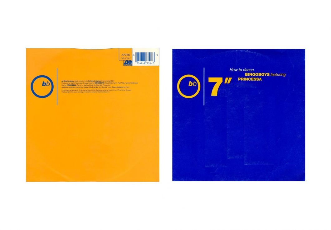
At the time, ‘big graphics’ were very much part of the club scene (large catalogue numbers, barcodes, quotes – leaning more to the industrial aesthetic as opposed to the more organic flared acid Baggy look) and we created the twelve inch with a large 12″ and the CD with a 5″. Another colour we used was Pantone 123 – the ‘Kodak yellow’ as we affectionately named it and this colour made its way onto many early works – especially East 17. We styled the type as a sort of James Bond 007 pistol and kept the front and back cover layouts regimented. The key lines around the barcode and cat number were all drawn with Rotring pens and the artwork was “lick and stick” bromides from the typesetters cut and pasted onto layout board.
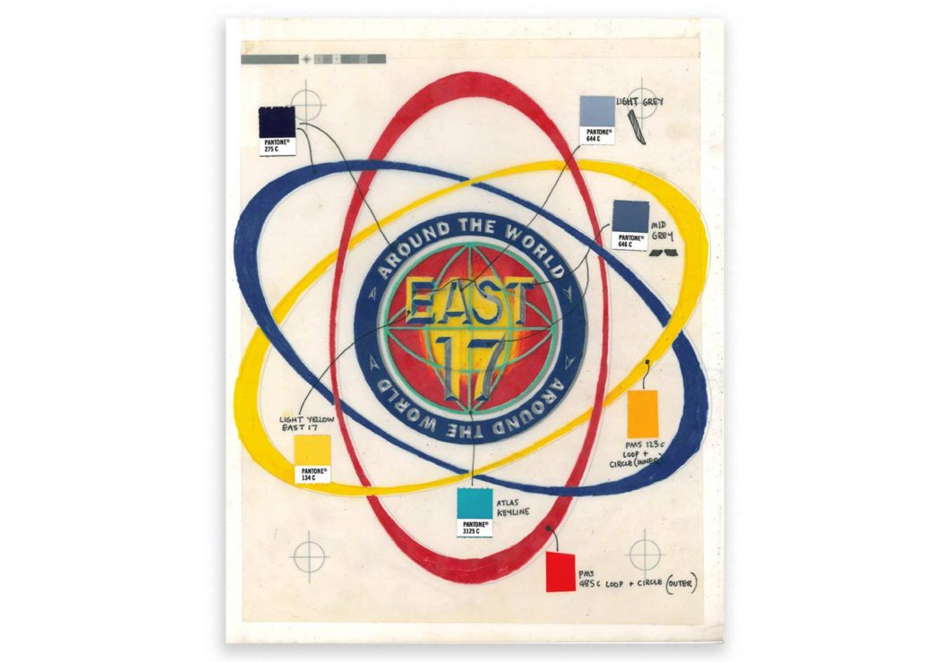
Pantone 123 in use for East 17 ‘Around The World’ logo, trace overlay mark up on board – we used this colour so much we ran out of PMS chips, and had to buy A2 sheets to match the demand of artwork leaving the studio (alongside ‘Post Box red’ PMS 485, the other E17 primary brand colour).
The print and digtal editions of the January issue in which the interview features is available from Pocket Mags.