


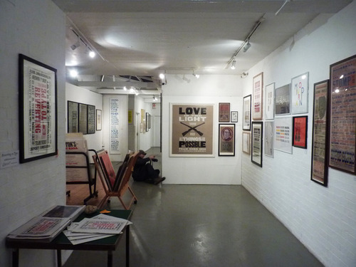

Keeping inspired and stimulated is important for us graphic designers and brand consultants and that doesn’t always come easy when sitting staring at a screen. So, apart from all our extra-curricular gallery, gig, googling, lecture and museum visits, we frequently invite well known figures in the realms of image making, design and art to share their world with the Form team. And occasionally we venture out and about – this month took us to see the Reverting to Type exhibition at the Standpoint Gallery, Hoxton, plus an insightful tour of the fabulous letterpress studio: New North Press, located upstairs from the gallery.
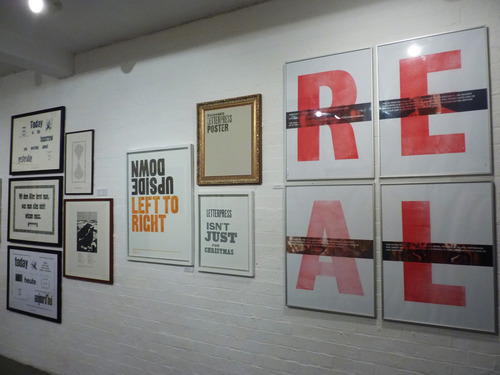
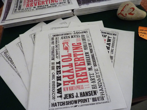
Curated by Graham Bignell of New North Press and graphic designer Richard Ardagh, the exhibition presents contemporary letterpress practitioners, showcasing how a centuries-old craft is being reinvented for modern day usage. Prints and publications from around the world highlight the current resurgence of interest in letterpress; from computer-based designers with a desire to ply a craft with a tactile immediacy that has been lost with modern technology, to traditional presses finding a new way to revitalise their design output.
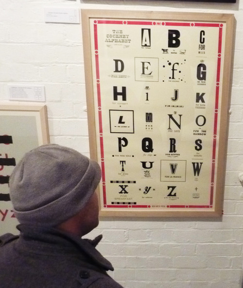
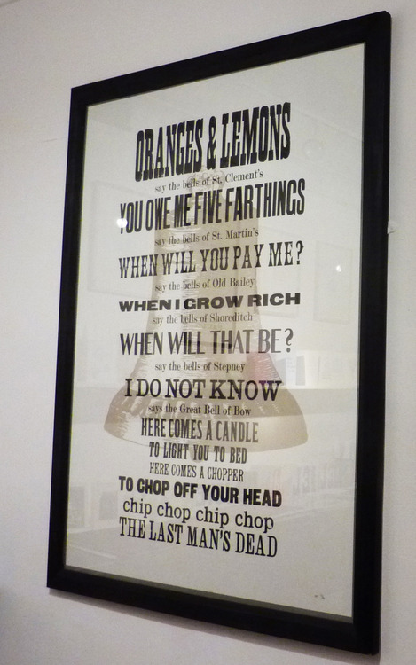
The letterpress print “Oranges and Lemons” has long been a favourite of mine after spotting it in the Nelly Duff gallery on Columbia Road a few years ago. I love the heritage of the song which name checks so many parts of London I have come to know (“Oranges and lemons say the bells of St Clements, when I grow rich, say the bells of Shoreditch…”). It set me off on some mini research into traditional regional songs which even led me to a surreal rediscovery of my Geordie roots at a rendition of historic songs in a church hall in Alnmouth, Northumberland last summer. It was only this visit to Standpoint Gallery which alerted me to the fact that the man behind the ‘Oranges and Lemons’ print was graphic designer Richard Ardagh, who has worked with New North Press to produce collaborative poster editions including and a 150th anniversary print for Wilton’s Music Hall.
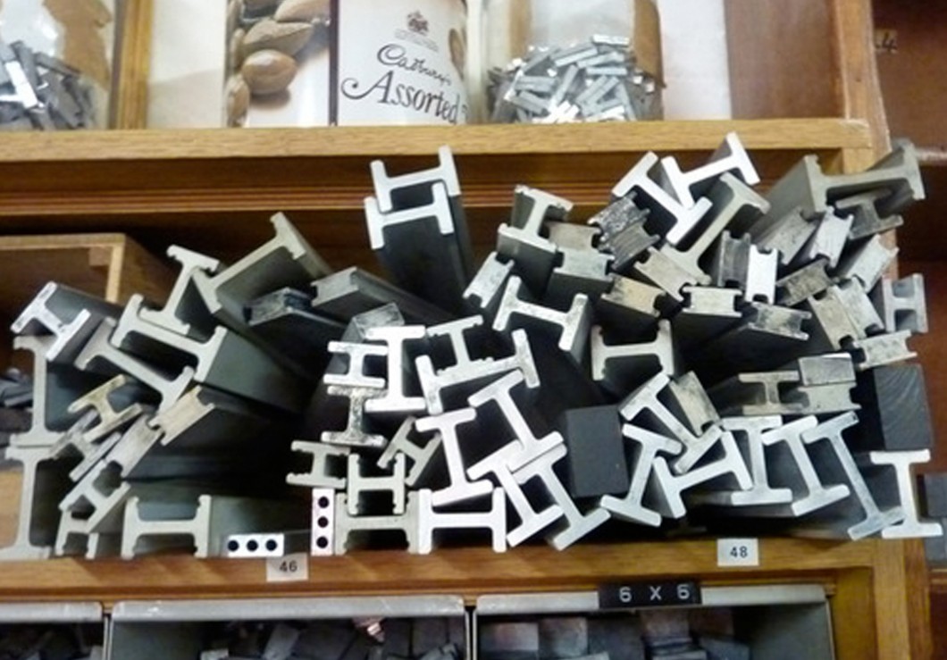
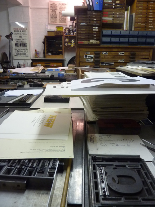
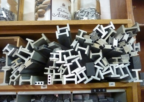
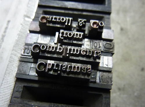
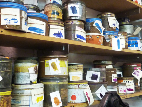
New North Press is an artisan letterpress print studio, specialising in setting and printing by hand. Graham gave us a fascinating tour and let us have a good rummage around endless drawers full of metal letterpress type, many of which have been avidly collected from many other printers who have closed shop in recent years. He is a man dedicated to his craft and the studio is a treasure trove of all things type.
Incidentally, here’s an interesting fact: The terms lower case and upper case originated from the way that type (i.e., individual letters that were cast from metal for use in printing) was stored in the days of hand typesetting. The type was sorted by letter and kept wooden or metal cases, with separate cases for capital and small letters. Usually the two cases were placed one above the other on a rack on the typesetter’s desk, with the case containing capital letters (i.e., the upper case) positioned above the case containing the small letters (i.e., the lower case).
Posted by Paula Benson.