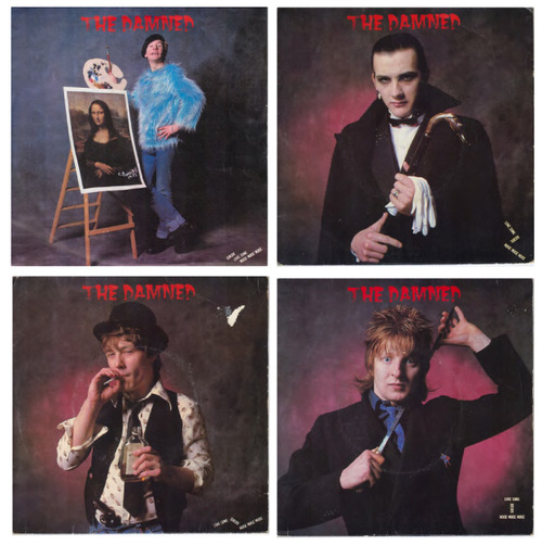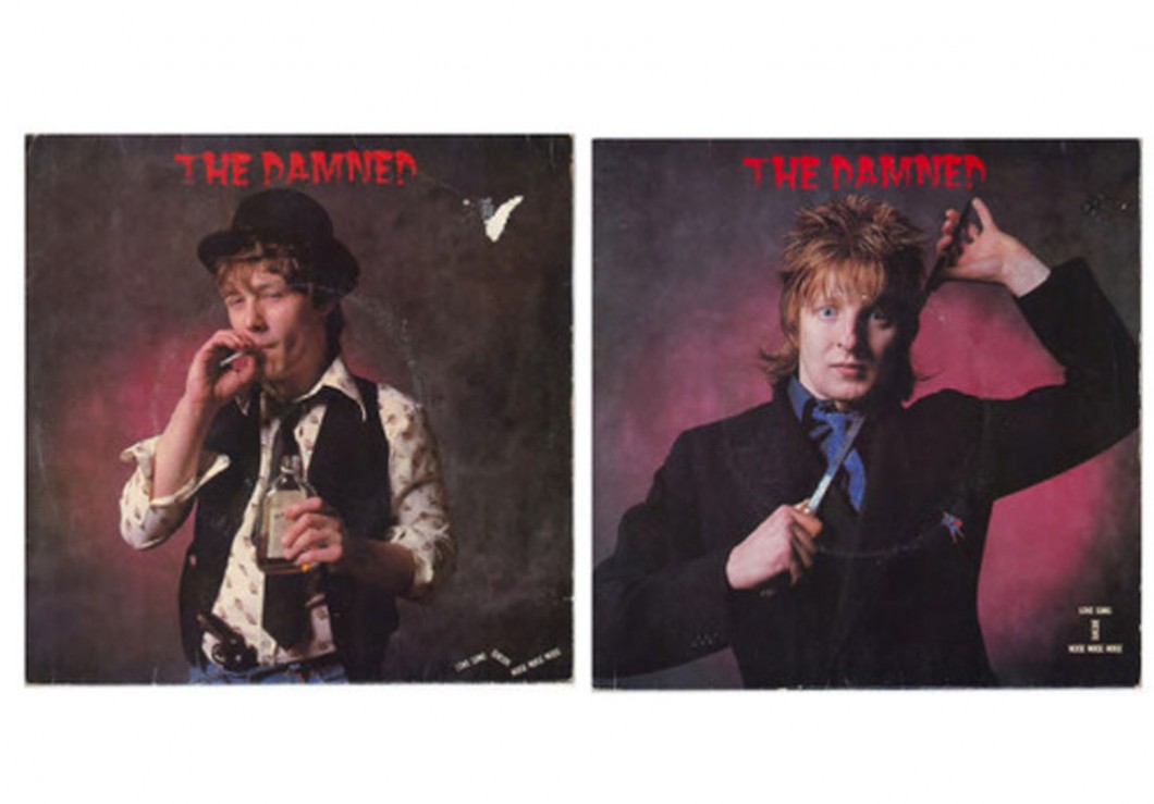
The Damned – Love Song
Design: Phil Smee at Waldo’s
Photography: Alan Ballard.
Originally produced by Ed Hollis* (manager of Eddie and the Hot Rods), this single was the first release from the band after their move from Stiff to Chiswick (started by Roger Armstrong and Ted Carroll) in 1979, an epochal year for music and design with releases by Joy Division (Unknown Pleasures), Tubeway Army (Are Friends’ Electric?), The Cure (Three Imaginary Boys), The Clash (London Calling), The Specials (Gangsters) The Dead Kennedy’s (California Uber Alles), Joe Jackson (Look Sharp!), The Police (Can’t Stand Losing You), Pink Floyd (The Wall/Comfortably Numb), Michael Jackson (Off The Wall), Buzzcocks (Spiral Scratch EP), OMD (Electricity). It was also the year Sid died, and X-Ray Spex split.
I bought my first two ‘Love Song’ covers (Dave Vanian and Rat Scabies) in ‘83, Captain Sensible in Brighton in ’86 and the “very hard to come by” Algy Ward a year later. I’ve always been a fan of multiples (probably down to appreciation for Warhol’s’ industrial print technique), the idea of parts creating the whole – especially when each part of this release is so iconic**.
The scant, minimalist typography nods to the style of the zeitgeist (Ai and Barney Bubbles), yet the imagery and 50’s “B-Movie” logo shouts contradiction, and I love it for that. I’ve been in contact with Phil Smee and Roger Armstrong over this release and they’ve been extremely insightful. Phil: “My designs from the late 70s and early 80s are fascinating to me – as I remember the primitive way they were constructed. Logos were made up by sticking letters that were photocopies of alphabets out of type books… The concept of 4 different sleeves was genius on Ted’s part. I remember going through Alan’s photos with Roger and Rick, and coming to a decision on which frames to use. I’m not sure where I got the lettering from… I know it was quite an unusual source – maybe one of my American 50s or 60s typebooks”.
The photographs are rich, textural, shot with a lighting style that feels neoclassical. I was often intrigued that The Damned so successfully separated themselves from their peers by parodying themselves as ‘graphic novella’ protagonists so convincingly (a la Cramps / Revillo’s), on the covers, their stances are humourous with an underlying sense of unease – and that juxtaposition is what makes this such a great piece of art for me. -PW-
As a post script: Phil Smee was also responsible for the Motorhead logo – one of the great rock logos (bar Saxon) which I will be talking about soon.
*The Ed Hollis master was remixed c/o Roger as the single. Both versions of Love Song appear on the album Machine Gun Etiquette.
**Roger informs me that the 4 releases (not to mention re release in red vinyl) was “crass commercialism that worked as a fine art statement; The single went to 19 in the charts and the band did their first Top Of The Pops.”
http://www.officialdamned.com
http://www.acerecords.com/