

Our new logo design and brand identity for tour operator BSpoke has recently launched.
BSpoke organise cycle holidays across Europe for the mid-range to luxury end of the market and are aimed at the 40-70 year old audience as well as families of all ages looking to cycle together. We were asked to design a logo and create a style guide to herald a new era for the company: The logo needs to be adaptable and embrace the fact that the client’s long term goals are to offer additional types of holiday (such as walking or boating as well as cycling) through this brand in the future. Additionally, they asked us to avoid including any visual reference to a specific type of landscape (such as lakes and mountains as demonstrated in their existing logo) and to create a look and feel that would allow the BSpoke company to transition into more of an umbrella brand.
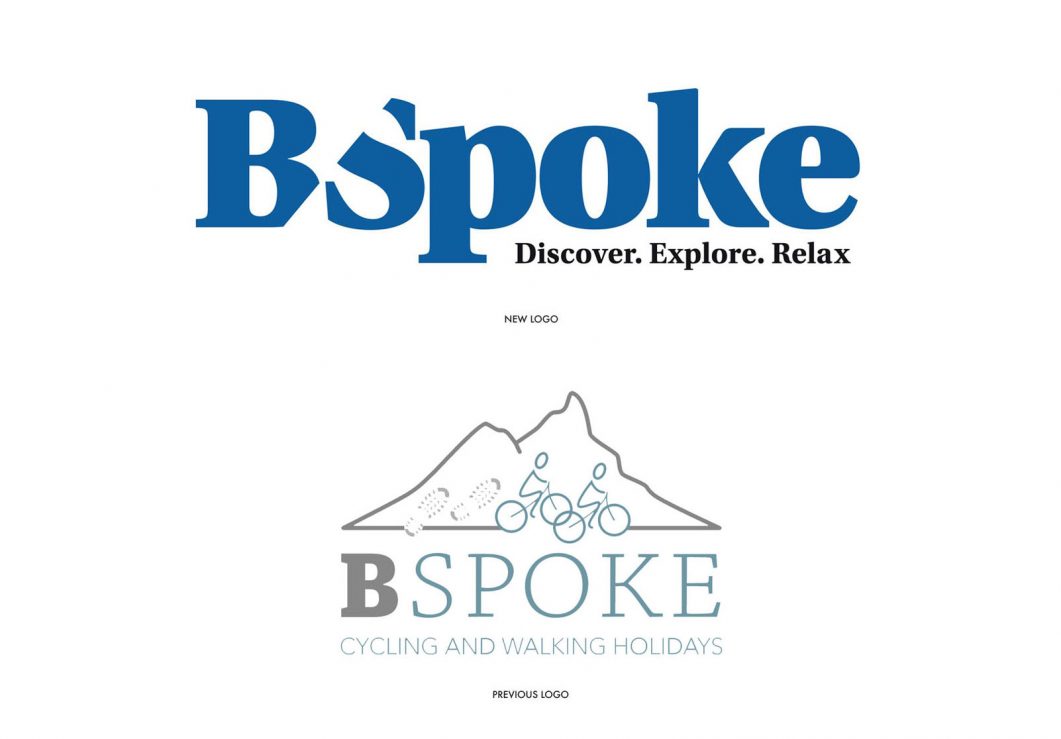
Our solution is therefore a typographic logo which reflects the client’s wish to communicate that they are secure and established, but independent at the same time – a reliable company offering tailor made adventures. Our choice of tightly kerned, bold slab serif is friendly, open and has gravitas. The word “tours” has been dropped from the logo on our recommendation and the new strap line “Discover. Explore. Relax” (provided by the client) has been incorporated.
The letters ‘B’/’S’ slice together at an angle and this slicing device together with diagonal lines and shapes extend into a wider visual language that can be used on brochure covers, digital advertising and the client’s website. The device allows the client to bring together several different types of images which tell a bigger story than one single image and helps them communicate that their tailor made trips bring many different holiday experiences together – not just the cycling or activity itself, but also the experience of the gorgeous landscapes, hand-picked hotels, gourmet food offerings as well as history and culture along the way.
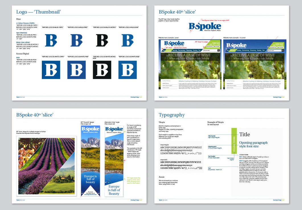
Above: Sample pages from the style guide
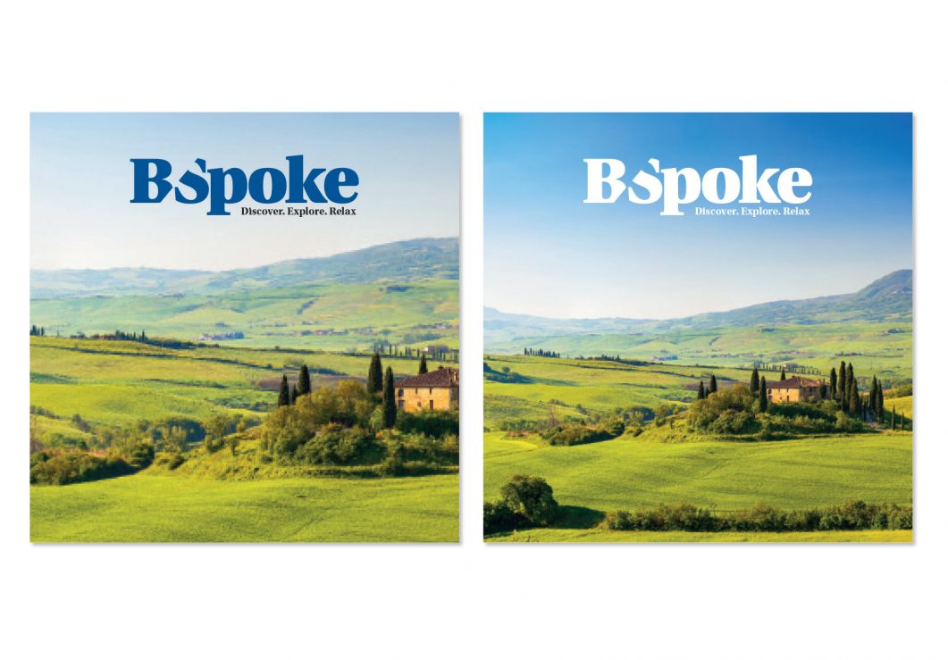
We supplied the client with a full compliment of logos in all formats that they will need now and in the future, for print and screen – the main logo has been created in both positive and negative versions so that the client has the flexibility to use it on white backgrounds or reversed out of full bleed images. A shorthand version has also been created for social media profiles and our style guide also details fonts and styles for accompanying typography.
The client has already begun to roll out the identity which has enabled them to achieve a much more established and reliable brand identity.
“It was a pleasure to work with Paula and Paul at Form on our first logo and style re-design. Within a narrow time frame, they provided multiple design concepts and the end result was a fresh and striking style which has helped us launch our new holiday programme and which will enable us to continually develop our brand over the coming years.” says BSpoke’s Miles Porter.
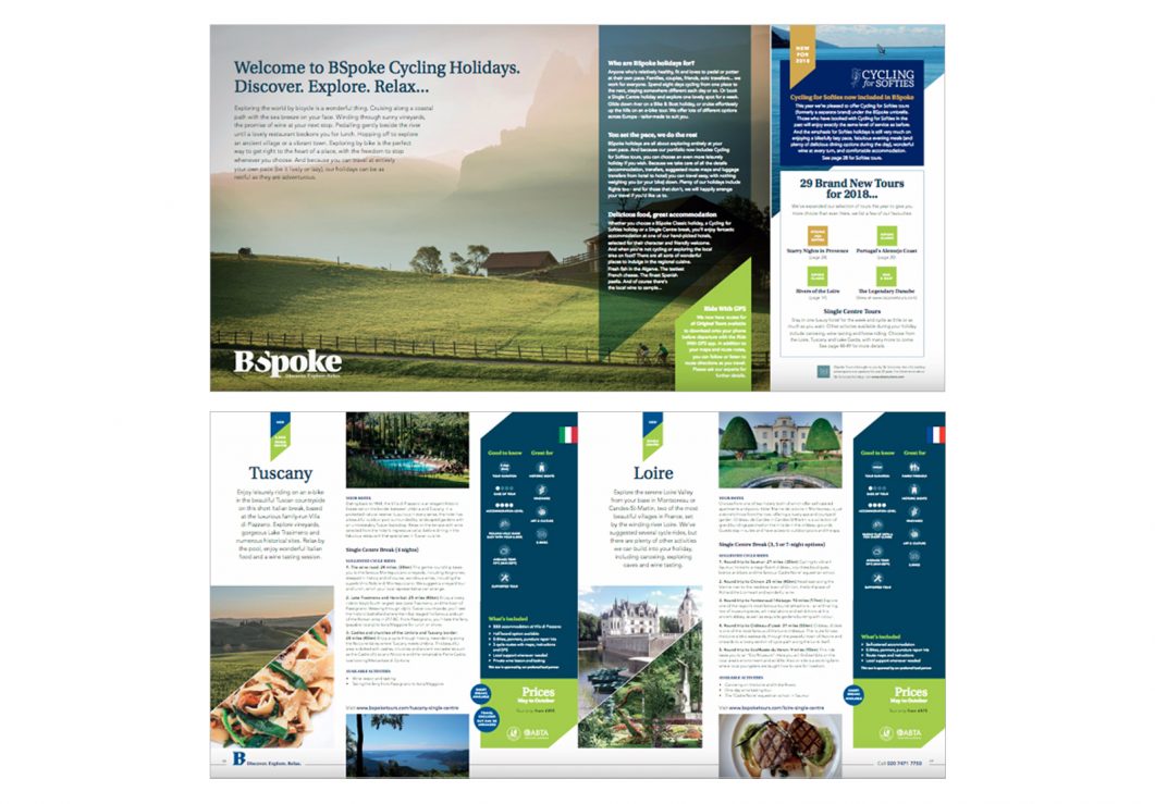
Below: Examples of how the identity has been rolled out by the client in their forthcoming brochure.
See more Form logo designs here >