

Our in-depth knowledge of the events industry was a deciding factor in Live Union’s choice of design agency to refresh their brand identity: from logo design and website, to style guide and credentials documents. “As soon as we met Form we were determined to work with them on our rebrand. Their portfolio of design projects across all types of live experience is second to none” says Jez Paxman, Live Union’s Creative Strategy Director.
Live Union create events for business and employee audiences. Innovations in formats and technologies are seeing them re-imagining what an event can be, drawing inspiration from far and wide to design events that change minds and behaviours.
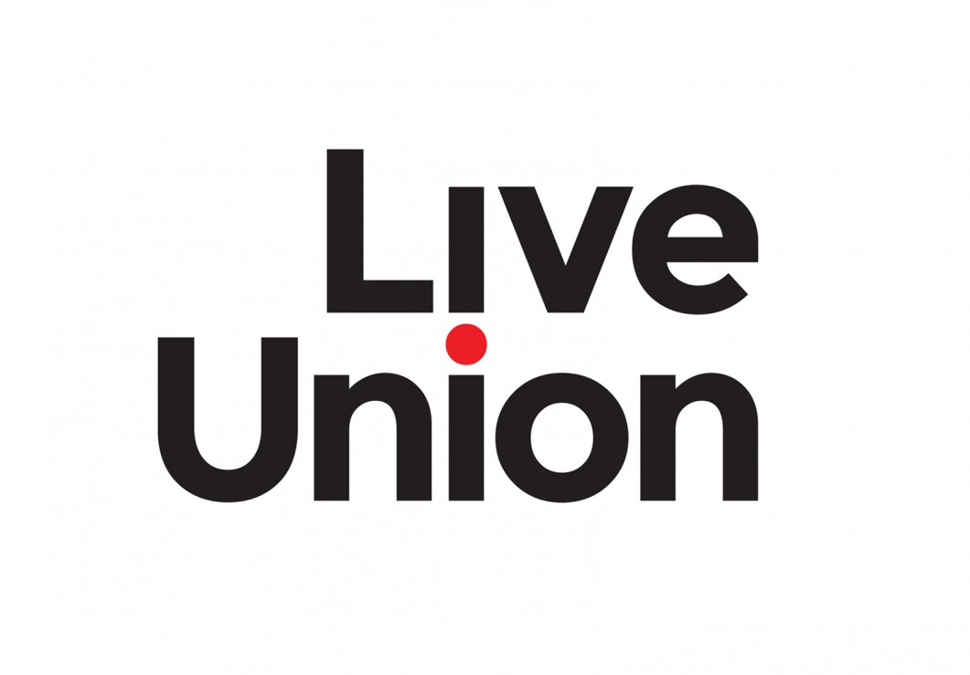
Live Union asked us to create a confident logo and identity to communicate their creative thinking as well as their in-depth experience in the events industry.
The typographic logo solution is simple with a subtle twist: “The dot of the “i” flips from “Live” to “Union” and unites the two words, illustrating in a subtle and smart way how Live Union facilitate connections” says Form Creative Director, Paul West.
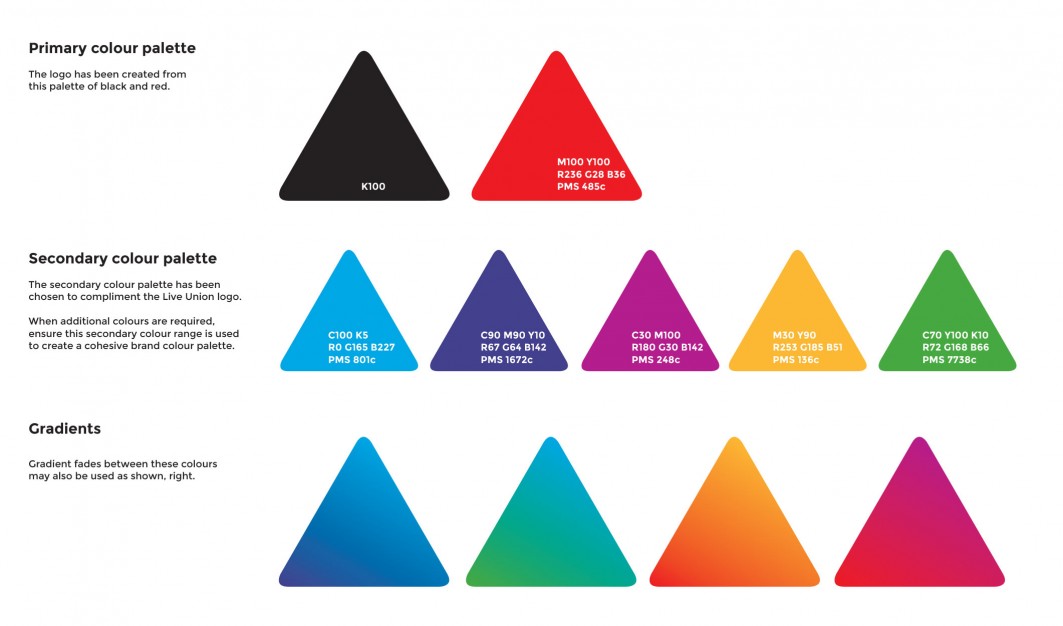
The bold, main colour palette of black and red carries forward links to Live Union’s previous identity. The new, vivid secondary colour palette is drawn from the “Delegate Value Proposition” (DVP) which we also redesigned.
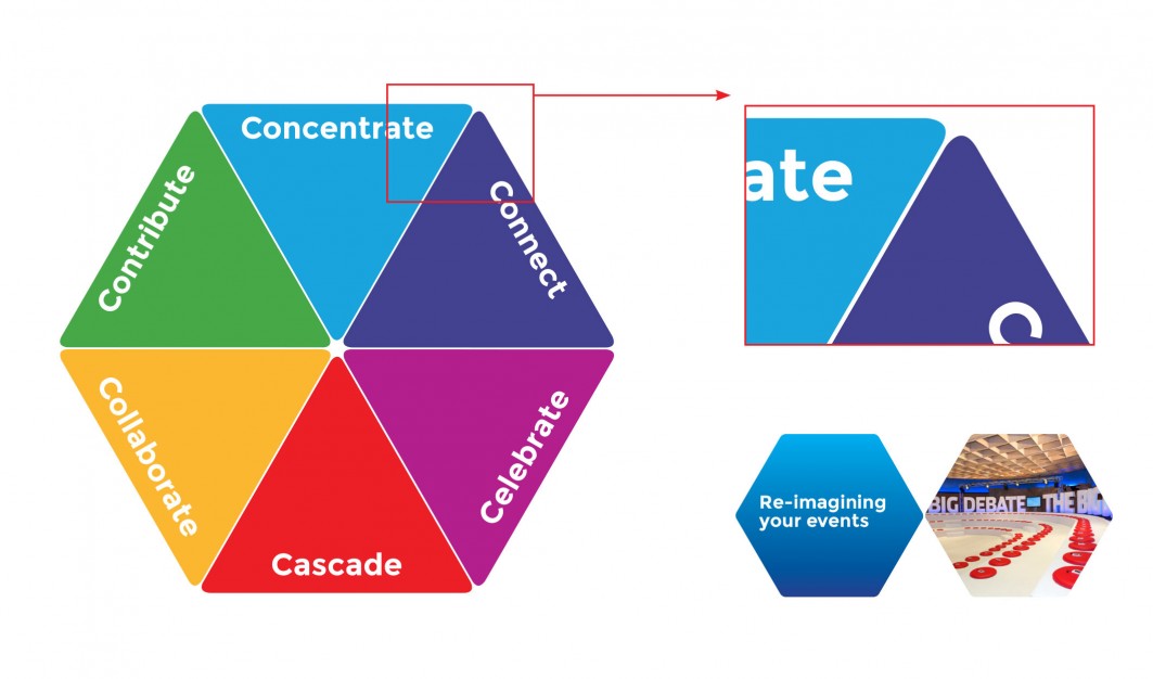
The DVP is a clever tool which Live Union use in presentations to convey the different components they employ to create events – depending on their clients aims and desired outcomes from the event.
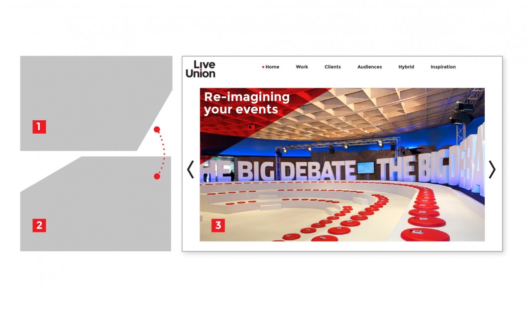
The multi-segmented DVP hexagon shape was redesigned to be made up of specific angles and rounded corner segments. This shape will also be used in Live Union’s wider communications as a holding device for key statements, quotes and images.
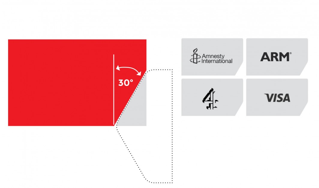
The 30 degree angle of the hexagon segments informs the angle of “corner clipped” rectangles. These clipped rectangles will house images and logos across the website and credentials documents.
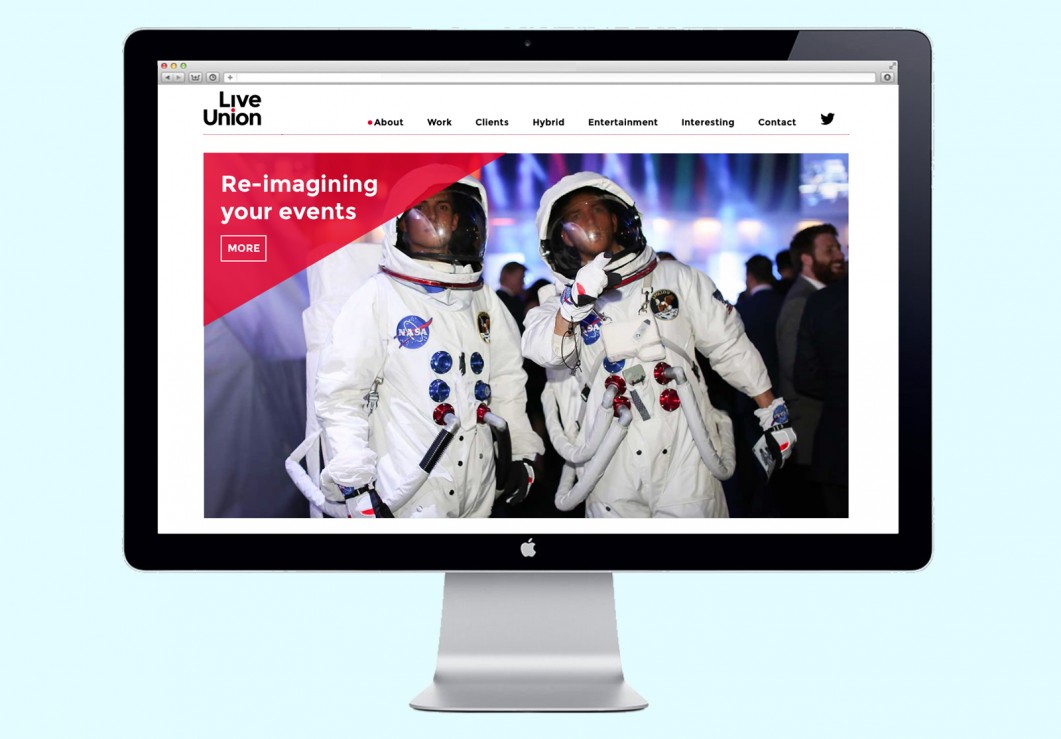
When that same corner clipped box is inverted and rotated, it creates an area top left of the rectangle which will be used as a holding device for titles and text over images, as seen on the website homepage slider image. These shapes, angles and colourways create a coherent visual language and give Live Union a flexible identity with a kit of parts they can draw on for communications created inhouse.
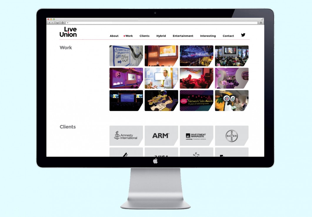
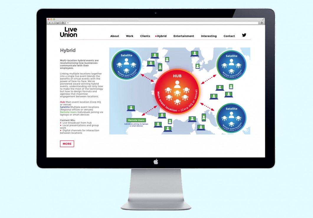
 Form also designed the vertically scrolling website > based on a tight brief from Live Union and worked with independent programmer Tom Shooter to build the website based on a highly-customised WordPress template.
“We loved Form’s working process, the way they challenged our thinking, their craft and most importantly the brilliant identity they created for us.” Jez Paxman, Live Union
See other examples of our design and branding work for events:
Taste Festivals
Latitude Festival
Reading and Leeds Festival
100% Design
Logo Design